Coffee Mug Drawings: What Buyers Should Check Before They Buy
Reading time: about 9 minutes
A good mug drawing can carry a design. A bad one can make the whole mug feel off by a few millimeters. That usually shows up as a crowded handle, a thin line that disappears against the glaze, or artwork that wraps awkwardly around the curve.
We see that problem often in our store: shoppers like the illustration online, then realize the mug shape changes how the drawing reads in real life. If you are comparing options for a gift, a desk mug, or a daily coffee cup, the drawing is only half the decision. The mug body, rim, and handle matter just as much.
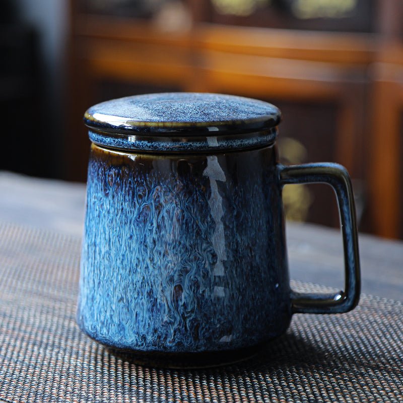
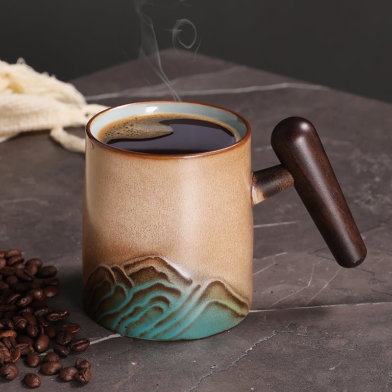
If you want to compare the actual options we carry, start with our full collection and then narrow down by shape. For example, the Round Coffee Tea Mug gives a classic profile, while the Landscape Tall Coffee Tea Mug changes how a horizontal drawing is framed. If you want a richer color backdrop for line art, the Emerald Coffee Tea Mug is worth a look.
What should coffee mug drawings look like on a real mug?
On a screen, a drawing is flat. On a mug, it has to survive a curve, a handle break, and a visual seam where the print ends and begins. That means the strongest coffee mug drawings usually have clear line weight, enough negative space, and a composition that does not depend on tiny details to carry the image.
In practice, we look for a few things before we recommend a design:
- Readable line work: Thin, hairline details can disappear against glossy ceramic or under bright office lighting.
- Balanced placement: The drawing should sit far enough from the handle that it does not feel cut off when someone is holding the mug.
- Good contrast: Dark drawings on lighter mugs or bright mugs with intentional contrast usually read more clearly than muted art on a busy surface.
- Enough margin: Art that reaches too close to the rim or base often feels cramped once the mug is in use.
For buyers, that matters because a mug is rarely viewed from one perfect angle. It gets picked up from a desk, rotated in the hand, washed, and placed back down. The drawing should still look intentional in all of those moments.
Which mug shape shows the drawing best?
The shape changes the whole presentation. A wide-bodied mug gives more room for art, but a taller mug can make a drawing feel more modern and vertical. The right choice depends on whether the design is built for a wide scene, a centered icon, or a repeating motif.
| Shape | What it does well | Trade-off |
|---|---|---|
| Round mug | Classic look, easy to read from the front, comfortable for everyday desks and kitchen counters | Wide artwork can wrap too far around the sides if the design is not balanced |
| Tall mug | Gives vertical drawings more room and can make simple line art feel cleaner | Small drawings can look lost if the layout does not use the height well |
| Colored mug | Adds contrast and helps black, white, or minimalist art stand out | Some delicate colors lose visibility if the artwork is too light |
For a straightforward daily-use option, the Round Coffee Tea Mug is the easiest shape to live with. If your art is more scene-like or stacked vertically, the Landscape Tall Coffee Tea Mug usually gives the drawing better breathing room. If you want contrast to do some of the visual work, the Emerald Coffee Tea Mug can make a simple illustration feel more deliberate.
Our store sees the same pattern again and again: the mug shape that looks nicest in the product photo is not always the one that best supports the drawing. Buyers who check the silhouette first tend to be happier with the mug after a week of real use.
What defects or weak points should you check before ordering?
This is where buyers save themselves from disappointment. A mug drawing can be attractive and still fail if the print execution is poor. We recommend checking for the same issues we inspect when handling product samples and preparing orders.
- Edge alignment: Look for artwork that sits straight and is not tilted toward the handle or base.
- Color consistency: The drawing should not look faded in one section and overly dense in another.
- Surface finish: Glossy surfaces can reflect light strongly, which may wash out very light lines.
- Seam handling: A wrap design should not lose the main subject right where the print meets the back side.
- Handle clearance: Check that the drawing is not squeezed too close to the grip area, where fingers naturally rest.
There are also practical limits. Coffee mug drawings with tiny facial features, dense text, or fine crosshatching are not the best choice if you want a mug that stays readable after repeated washing and daily handling. We like art that still makes sense after the first pour of coffee and the hundredth trip to the sink.
If you want a deeper pre-buy checklist focused on artwork quality, our article Coffee Mug Drawings: What to Check Before You Buy covers the visual basics in more detail.
Which coffee mug drawings work best for gifts, desks, and everyday use?
Different buying situations call for different drawing styles. A mug for a gift box needs to feel immediately legible. A desk mug needs to look good from a few feet away. A daily kitchen mug needs to survive practical use without feeling too precious to grab.
Here is how we usually sort the options:
- For gifts: Choose drawings with a clear subject and simple contrast. The recipient should understand the idea instantly when opening the box.
- For office desks: Pick art that reads well from across a table. Clean outlines and uncluttered compositions work best.
- For daily kitchen use: Favor drawings that are not too detailed and a mug shape that feels stable in the hand.
- For display-first buyers: A bolder color or a more distinctive silhouette can matter more than maximum capacity or neutral styling.
The important trade-off is this: highly detailed coffee mug drawings can look impressive in photos, but they are usually the least forgiving in real life. If the mug is going to be used every morning, not just displayed, simpler line art usually ages better visually.
For shoppers comparing capacities and fit alongside the artwork, our size-focused posts can help: 11 oz Coffee Mug: Size, Fit, and What to Check Before You Buy and 12 Ounce Coffee Mug Buying Guide: Size, Fit, and Best Uses. That matters because the same drawing can feel crowded on one mug size and balanced on another.
How do we compare mug options in our store?
We try to make the choice practical, not decorative for its own sake. In our experience, the best mug is the one that fits how someone actually drinks coffee: at a home counter, on a work desk, or as a gift that needs to make sense the moment it is unboxed.
Here is the quick comparison we would use if we were shopping for ourselves:
- Choose the Round Coffee Tea Mug if you want a familiar everyday shape and a drawing that should feel easy to read from the front.
- Choose the Landscape Tall Coffee Tea Mug if your artwork leans vertical, or if you want a slightly more distinctive silhouette on the table.
- Choose the Emerald Coffee Tea Mug if you want stronger visual contrast and a mug that feels a little less standard than plain white.
If you are comparing beyond just the drawing, our size and fit guides are useful as a second step. The articles 10 oz Coffee Mug: Size, Fit, and What to Check Before You Buy and 12 oz Coffee Mug: Size, Fit, and What to Check Before Buying are practical if you are choosing between compact and more generous mugs. The right mug drawing still needs the right mug body.
What care and use details should you confirm before buying?
Care is where a pretty mug either stays nice or starts to look tired. We always advise buyers to check the product details before assuming a mug is dishwasher safe or microwave safe. If the listing does not confirm it, treat that as a signal to handle the mug more gently.
Three details are worth confirming on any mug with drawings:
- Finish type: Glossy finishes can show reflections; matte finishes can change how printed lines appear.
- Washing guidance: If the print is decorative rather than fully integrated into the glaze, hand washing is often the safer routine.
- Heat exposure: Very hot washing cycles and repeated microwave use can be harder on some printed surfaces over time.
We also suggest paying attention to the bottom edge and handle connection. Those are the spots that get set on counters, bumped in sinks, and touched most often. A mug with strong art but weak day-to-day durability is not a good buy for someone who will use it every morning.
If your goal is to buy once and use often, the safer path is usually a mug with a simple drawing, a clean glaze, and a shape that does not fight the design.
Frequently asked questions
Do coffee mug drawings look better on white mugs or colored mugs?
White mugs usually give the most straightforward contrast, especially for black line art or minimalist illustrations. Colored mugs can work better if you want the design to feel richer or more styled, but low-contrast art is easier to lose on a darker surface. For buyers who want the artwork to stay readable at a glance, contrast should come before color preference.
Are detailed coffee mug drawings a good choice for everyday use?
Usually not if the detail is very fine. Small lines, tiny text, and dense crosshatching can look sharp in a product photo but disappear faster in daily handling, bright kitchen light, or after repeated washing. Simpler drawings tend to hold up better for everyday use.
What mug shape is best for a horizontal drawing?
A wider or more balanced round mug usually suits horizontal art better because the composition has more side-to-side room. A tall mug can still work, but only if the drawing is intentionally arranged to use vertical space. If the artwork is wide and scenic, the mug shape should not squeeze it vertically.
Should I avoid mugs with artwork that wraps all the way around?
Not always, but you should check where the main subject lands relative to the handle. Full-wrap art can look premium when it is aligned well, but it can also split the image in an awkward place. For a gift or a desk mug, a clear front-facing drawing is often the safer choice.
What is the safest choice if I want coffee mug drawings as a gift?
Pick a mug with a simple drawing, a readable shape, and enough contrast that the art is obvious the moment the box opens. If you are unsure, start with a classic shape like the Round Coffee Tea Mug and compare it against the rest of our collection before deciding.
If you want a quick next step, compare the shape, contrast, and line clarity on the three mugs above, then pick the one that fits how you actually use it. If you are still deciding, start with our full collection and filter by the mug silhouette that best supports the drawing you want to see every day.
Read more
Coffee Mug Display Ideas That Actually Work in Real Kitchens
Practical ways to build a coffee mug display that looks intentional and still works for daily use. We cover shelf fit, mug shape, spacing, and which styles are worth putting on display.
Czytaj dalej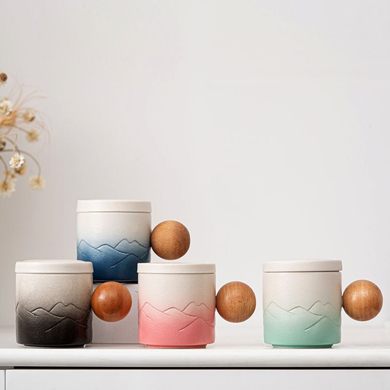
Easter Coffee Mugs: Choosing a Gift That Gets Used
We compare Easter coffee mugs by shape, size, and everyday comfort so you can pick a gift that still earns a place on the kitchen counter after the holiday. Includes our best CoffeifyMug options fo...
Czytaj dalej
Zostaw komentarz
Ta strona jest chroniona przez hCaptcha i obowiązują na niej Polityka prywatności i Warunki korzystania z usługi serwisu hCaptcha.