Coffee Mug Printing for Daily Use: What Buyers Should Check First
Reading time: about 9 minutes
A mug can look perfect in a mockup and still feel wrong on a desk if the handle is awkward, the artwork crowds the seam, or the color looks different in real light. We see that often in our store: the buyer likes the graphic, then notices the mug shape is doing half the work.
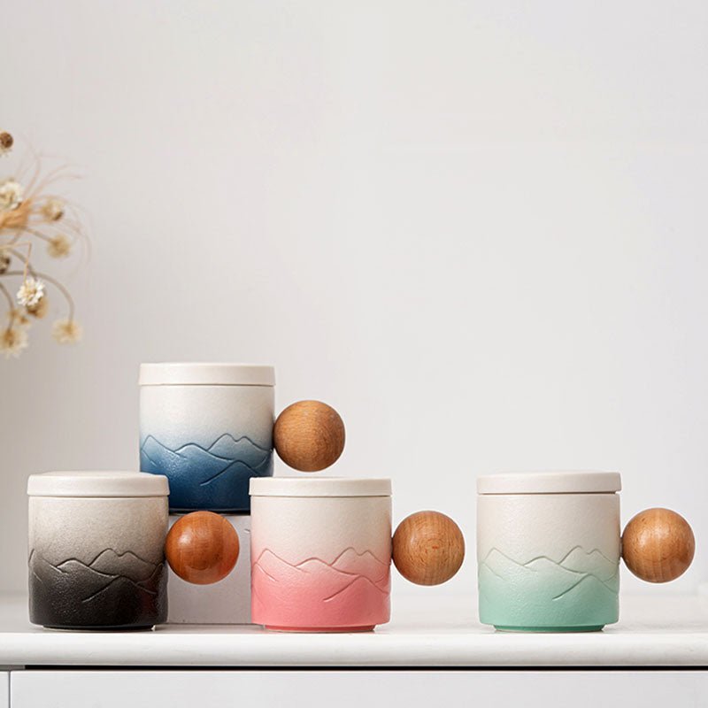
That is why we treat coffee mug printing as a buying decision, not just a design choice. The best result usually comes from matching the mug shape, the print area, and the way the mug will be used every day. If you want to compare styles while you read, start with The Gradient Coffee Tea Mug, Retro Coffee Tea Cup, or Ball Handled Coffee Tea Mug. You can also browse all mugs in our collection if you want to compare the full range before choosing.
What should you check before ordering coffee mug printing?
Start with the parts of the mug people actually touch. The handle should feel comfortable in a normal grip, the rim should not feel overly thick, and the printed area should make sense from the angle the mug will sit on a desk or kitchen counter. A design that looks strong front-on can lose clarity if the logo sits too close to the handle or gets cut off by a curve.
In our experience, the most common mistake is overestimating how much visual space a mug really has. A simple logo, a short line of text, or a clean photo layout usually performs better than a dense layout packed edge to edge. That is especially true on shaped mugs or mugs with a bold finish, where the form itself already adds visual weight.
- Check the viewing side: left-handed and right-handed users do not see the same side first.
- Check the message length: short phrases read faster and stay cleaner on curved surfaces.
- Check the background: light art usually needs stronger contrast on glossy ceramic.
- Check daily use: office mugs need a different balance than display-only gift mugs.
If you want a practical pre-order checklist, our guide Coffee Mug Printing: What Buyers Should Check Before Ordering covers the basics buyers tend to miss on the first pass.
Which mug shape works best for your artwork?
Shape changes the final look more than most shoppers expect. A tall, straight-sided mug gives more predictable placement for logos and text. A retro shape creates a warmer, more nostalgic feel, but it asks more from the artwork because the form already has character. A handled mug with a unique grip can make a gift feel more memorable, though it is not the best choice for very intricate layouts.
| Mug style | Best use | Trade-off |
|---|---|---|
| Gradient Coffee Tea Mug | Modern everyday use, simple artwork, desk gifting | The color field can compete with tiny text if the design is too busy |
| Retro Coffee Tea Cup | Vintage-style branding, cafe-inspired gifts, minimal graphics | Less forgiving for dense copy or crowded layouts |
| Ball Handled Coffee Tea Mug | Distinctive gifts, tactile feel, shorter slogans | The unusual handle becomes part of the design, so the artwork should stay clean |
That is the real trade-off with coffee mug printing: the more expressive the mug form, the more disciplined the artwork has to be. If your design is a portrait, a photo, or a lot of small text, a simpler mug shape usually gives you a safer result. If the design is a one-line message or a logo, a more distinctive shape can work well without feeling crowded.
We usually tell customers to choose the mug shape first and the artwork second. A strong shape can elevate a simple design, but a crowded layout rarely improves after printing.
What print details matter most on a mug?
Print placement is where a good mockup can still fail in real life. The handle creates a natural break in the image, the curve changes how far text can travel, and the bottom ring leaves less useful space than many buyers expect. A wrap design should feel intentional, not forced around the mug.
There are also finish trade-offs. Glossy ceramic usually makes colors feel brighter, but it can show reflections under office lighting. Matte or textured surfaces can look more premium in person, but they can soften very fine lines. If your artwork depends on sharp micro-details, test that layout at full size before committing.
We also think about the print mode the same way we think about the design: practical first. A mug that will live on a kitchen counter for morning coffee needs a print that still reads after repeated washing and handling. A mug meant for display can tolerate more delicate artwork, but it is not the right choice if the buyer wants something for everyday dishwasher use.
- Text weight: use a font heavy enough to stay legible on curved ceramic.
- Contrast: dark text on light mugs and light text on darker mugs usually reads best.
- Edge distance: keep important words away from the handle side and the very bottom.
- Complexity: photos and layered graphics need more breathing room than a single logo.
If you are still deciding between mug sizes and print balance, our size guides can help: 11 oz Coffee Mug: Size, Fit, and What to Check Before You Buy, 12 Ounce Coffee Mug Buying Guide for Daily Use and Better Fit, and 10 oz Coffee Mug: Size, Fit, and What to Check Before You Buy.
How should you think about size and daily use?
Size changes how the mug feels in the hand and how the printed design lands visually. Smaller mugs often work well for espresso drinkers, short coffee breaks, and gift sets where the printed message should stay compact. Larger mugs are better for office desks, longer drinks, and buyers who want the artwork to breathe a little more.
That is why we ask shoppers to think about the actual use case, not just the number on the page. A mug that stays at a desk all day has a different priority than a mug pulled from the cabinet once a week for display. For daily use, comfort and readability usually matter more than decoration density.
- Choose the mug size based on the drink habit, not the design alone.
- Match the artwork scale to the usable front face of the mug.
- Check whether the mug will be used for coffee, tea, or both.
- Decide if the mug needs to look good in unboxing photos, at a desk, or in a kitchen cabinet.
We use that same thinking when we help customers compare styles in our store. A mug for a coworker gift should feel easy to pick up and easy to like. A mug for home use can be more personal, but it still needs to hold up on a dishwasher shelf and feel stable on a counter.
Which CoffeifyMug styles fit different buyers?
If you want a direct path to purchase, these three products cover the most common coffee mug printing use cases we see.
The Gradient Coffee Tea Mug is a solid fit for buyers who want something modern and calm on a desk. The color treatment does a lot of the visual work, so it pairs best with simpler artwork, short names, or a logo that does not need extra decoration.
Retro Coffee Tea Cup makes more sense if the buyer wants a warmer, nostalgic look. It suits cafe-style branding, gift boxes, and designs that lean on character rather than high-detail illustration.
Ball Handled Coffee Tea Mug is the one we point to when the handle itself is part of the appeal. It is distinctive, easy to notice in a gift unboxing, and better for a short phrase or simple mark than for a dense layout.
Not every design needs the most decorative mug. A busy illustration on an already dramatic mug can feel crowded. A plain logo on a plain mug can feel too bare if the buyer wanted a gift with personality. The right match depends on what the mug is supposed to do on the first morning, not only how it looks in a preview.
What care and durability questions should you ask?
Before you buy, ask how the mug should be cleaned and how the print is expected to age. Repeated dishwasher cycles, especially with strong detergent and high heat, can be harder on printed finishes than hand washing. That does not mean every printed mug needs delicate treatment, but it does mean the buyer should know what level of care the mug asks for.
We also pay attention to the failure modes that show up in real kitchens and offices. The most common ones are chips on the rim from sink contact, scuffs from crowded cup racks, and visual wear around areas that get handled constantly. A mug that is tossed into a tight cabinet with metal cutlery nearby will age differently from one that lives on a clean shelf.
If you want a mug for heavy daily use, choose artwork that can tolerate a little aging. Clean typography, simple logos, and broader color fields usually age more gracefully than ultra-fine line art. If the mug is mostly a keepsake or a gift, you can be a little more decorative, but you should still think about where it will sit after the first unboxing.
Frequently asked questions
What artwork works best for coffee mug printing?
Simple logos, short names, and clear phrases usually print more cleanly than crowded layouts. Photos can work, but they need enough contrast and breathing room to stay readable on a curved mug surface. If the artwork depends on tiny details, it is better suited to a display piece than a daily-use mug.
Can coffee mug printing handle dishwasher use?
It depends on the mug and the print finish, so we do not recommend assuming every printed mug will age the same way. For everyday kitchen use, the safest approach is to follow the care guidance for the specific mug and avoid overly harsh washing conditions when you want the print to stay fresh longer.
Is a shaped mug good for photo printing?
Usually not if the photo is detailed or full of small faces, text, or background objects. A shaped mug works better with simple art, strong color blocks, or a short message. If the photo is the main selling point, a straighter mug surface is usually the better choice.
What size should I pick for office coffee?
Most office buyers want a size that feels comfortable for regular refills and fits under common coffee machines and shelves. If the mug will live at a desk, choose a size that balances hand feel and space for the design. Our size guides for 10 oz, 11 oz, and 12 oz mugs can help narrow that down before you order.
Which mug style is best for gifting?
For gifts, the best mug is usually the one that looks intentional without trying too hard. A retro shape feels nostalgic, a gradient mug feels clean and modern, and a ball handled mug feels more distinctive. Pick the mug that fits the recipient's daily routine, not just the artwork.
If you want the fastest next step, compare the three styles above against your artwork, then browse our full mug collection and choose the shape that gives your design enough space to read clearly in real use.
Read more
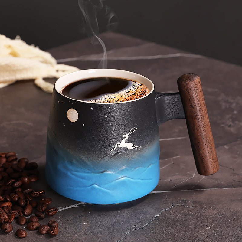
Moon Wood Coffee: What to Check Before You Buy
A practical buyer guide to moon wood coffee mugs from our store, focused on handle feel, daily use, care, and which style fits your setup best.
Weiterlesen
Best Mugs for Coffee: What to Buy for Daily Use, Gifts, and Desks
We break down the best mugs for coffee by shape, size, and real-world use, then compare our store picks for daily coffee, gifting, and desk setups.
Weiterlesen
Hinterlasse einen Kommentar
Diese Website ist durch hCaptcha geschützt und es gelten die allgemeinen Geschäftsbedingungen und Datenschutzbestimmungen von hCaptcha.