How to Draw a Coffee Mug: Shapes, Handles, and Real Proportions
Reading time: about 9 minutes
A mug looks simple until you try to draw one from the side. The ellipse at the rim turns odd, the handle floats away from the body, and the whole thing starts to feel like a cup that lost its balance.
Need a real mug reference fast?
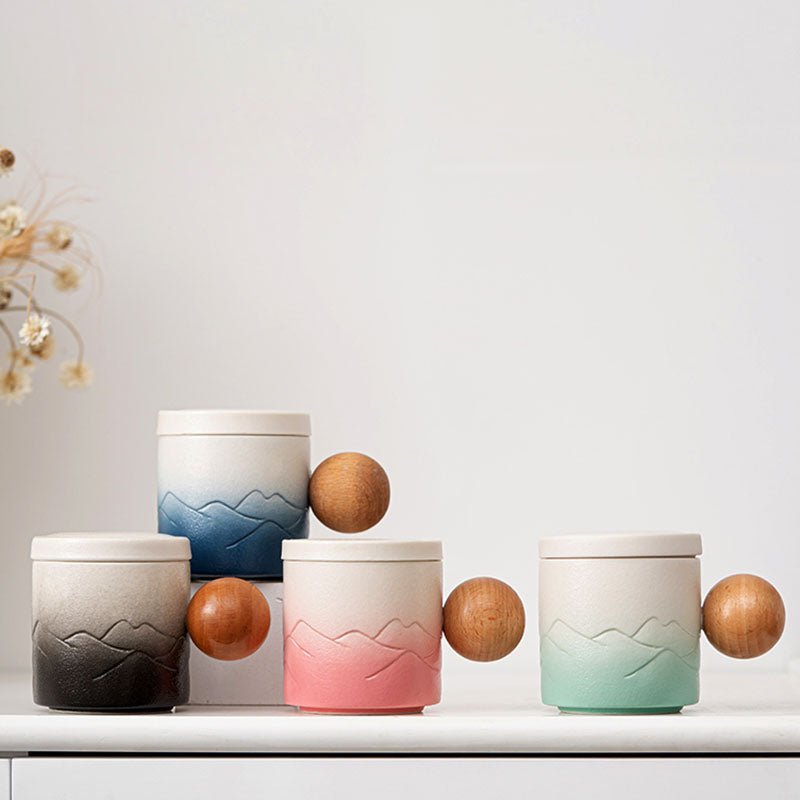
If you want to compare real mug shapes while you sketch, use the quick routes below to start with a simple daily-use profile, compare two stronger silhouettes, or open the fastest visual reference page before buying or drawing.
- Add the Round Mug to cart if you want the simplest broad-use mug shape to study or use every day.
- Start with the 2-Mug Starter Set if you want the quickest compare between a rounded shape and a taller profile.
- Pick a Mug Fast if you want the shortest side-by-side visual route before drawing or buying.
If you want the measurement side first, Best Coffee Mug for Desk Use, and 11oz Coffee Mug Buying Guide, and How to Draw a Mug of Coffee can help you compare nearby sizes before using a cart route.
We see that a lot because mugs are one of the easiest objects to sketch and one of the easiest to get slightly wrong. The fix is not fancy technique. It is careful observation, a few proportion checks, and understanding which details matter most in a real kitchen mug.
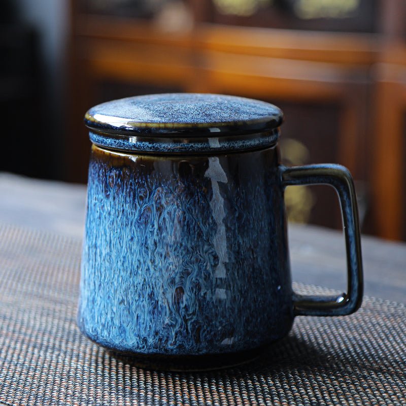
If you want a visual reference while you sketch, start with our product pages for the Elk and Moon Coffee Tea Mug and the Koi Fish Coffee Tea Mug. If you want to browse the full range of shapes and surfaces, the all collection is the fastest place to compare styles.
What should you notice before you start drawing a mug?
Before the pencil touches paper, look at the mug as a set of simple forms. Most coffee mugs are a cylinder with a handle attached, but that cylinder only reads correctly if the top and bottom edges line up in perspective. The rim is usually a thin ellipse, not a perfect circle, and the handle has thickness instead of being a flat outline.
We recommend checking three things first:
- Body shape: straight-sided, gently tapered, or slightly rounded.
- Rim thickness: thin lip, heavy lip, or a visible inner wall.
- Handle attachment points: where the handle meets the mug on the upper and lower sides.
That last point matters more than beginners expect. A handle placed too high makes the mug look top-heavy. Too low, and it looks compressed. On a real desk, that proportion is easy to judge because your eye can compare the handle opening against the body height.
If you want a step-by-step foundation before styling details, our related guide on How to Draw a Coffee Mug: Simple Shapes, Proportions, and Shading covers the basic build in a very direct way.
How do you block in the mug shape without losing perspective?
Start with a light rectangle or centerline. That gives you a boundary for height and width before you commit to the curve. Then sketch the top ellipse first, because the rest of the mug should follow that angle. If the top opening tilts toward you, the bottom should usually echo that same direction, even if the bottom edge is less visible.
Here is the simplest sequence we use when checking a mug sketch:
- Draw a centerline to keep the body from drifting sideways.
- Mark the full height and width with faint construction lines.
- Sketch the top ellipse, keeping both sides symmetrical.
- Drop the body lines downward, either straight or slightly tapered.
- Add the base ellipse or flatten the bottom if the mug sits flush.
A common error is making the left and right sides curve differently. Real mugs are usually manufactured with a fairly consistent profile, even if handmade pieces vary a little. If your sketch has one side bulging and the other side pinching in, it will look accidental rather than intentional.
For a more realistic mug silhouette, our other blog guide, How to Draw a Mug of Coffee: Step-by-Step Guide for Realistic Shapes, is useful when you want the object to feel grounded on a table instead of floating on the page.
How should you draw the handle so it looks attached?
The handle is where many drawings break. It should feel like an engineered part of the mug, not a separate loop glued on afterward. In our experience, the easiest way to keep it believable is to draw the handle as a band with thickness. Show the outer contour, then add the inner curve so the handle has a visible opening.
Pay attention to the space between the handle and the mug body. That negative space helps sell the form. If the handle hugs the body too tightly, the mug can look cramped. If the gap is too large, the handle can feel detached.
Three practical checks help here:
- The top attachment should sit near the upper third of the mug, not at the exact rim.
- The lower attachment should land below the midpoint, unless the mug is unusually tall.
- The handle opening should keep a consistent width as it curves, rather than narrowing abruptly.
That approach works whether you are drawing a plain white ceramic mug or a decorated one like our Crane Coffee Tea Mug, where the artwork gives you extra landmarks to measure against.
What shading makes a mug look solid instead of flat?
Shading on a mug is less about dark values and more about clean value transitions. A glossy ceramic mug usually has a highlight band along the curved side, a softer midtone, and a slightly darker edge where the form turns away from the light. If you are drawing a matte mug, those transitions are softer and less reflective.
We usually suggest thinking in three surface zones:
| Area | What to look for | Common mistake |
|---|---|---|
| Rim | Thin highlight on the edge and a narrow shadow inside | Making the rim too dark or too thick |
| Body | One main shadow side and one lighter side | Crosshatching every section equally |
| Handle | Inner shadow where the curve turns inward | Flattening it so it reads like a ribbon |
If you are shading from life, place the mug near a window or desk lamp and watch how the light catches the rim. A mug on a kitchen counter will often pick up reflected light from the counter surface, which softens the shadow at the base. That small detail helps a sketch feel real fast.
This is also where product materials matter. A glossy ceramic mug will show sharper highlights than a textured stoneware mug. A plain white glaze gives you clean contrast, while a printed surface adds visual noise that can either help or distract depending on your goal.
Which mug details are worth drawing, and which can you skip?
If your goal is a convincing sketch, not a technical product rendering, focus on the details people actually notice at a glance. On a real mug, the silhouette, handle, and rim usually matter more than tiny surface marks. A logo, animal motif, or band of color can help, but only after the form is correct.
Good details to include:
- A subtle base shadow where the mug meets the table.
- An inner rim line if the mug opening is visible.
- A soft highlight strip to suggest glaze.
- One or two decorative elements, not every printed pattern on the surface.
Details you can skip in a first sketch:
- Small scuffs on the foot ring.
- Fine print texture.
- Minor asymmetry from hand glazing.
That trade-off matters. A kitchen mug used for tea, coffee, or desk water usually does not need a hyper-detailed render. If you are drawing for practice, simplicity is better. If you are drawing to show a gift idea or product concept, the design motif becomes more important.
For inspiration, compare a graphic motif like the Koi Fish Coffee Tea Mug with the more atmospheric Elk and Moon Coffee Tea Mug. Different artwork changes how the mug reads on the page, even when the underlying shape is the same.
How do real mug sizes change the way you draw proportions?
Size changes the proportions people expect. A small espresso-style cup needs a tighter body and smaller handle. A standard coffee mug has enough width for a comfortable grip and a broader opening. Taller mugs often look more cylindrical, while shorter mugs look heavier and more stable.
We talk about this a lot because shoppers often compare mugs by use case, not just by image. A mug that looks elegant in a drawing may not be the one you want for long desk sessions, while a wide mug may be practical but less graceful on the page. That is why our size-focused posts, like 11oz Coffee Mug Buying Guide: Size, Fit, and Best Uses and 12 Ounce Coffee Mug Buying Guide for Daily Use and Better Fit, can help if you are drawing a mug you also plan to buy or gift.
Real-world proportion checks to keep in mind:
- A wider mug often needs a lower, broader ellipse.
- A taller mug usually has a narrower handle span relative to body height.
- A thick-walled mug needs a more visible inner rim line than a thin-walled one.
If you are sketching from a mug on your office desk, set it at eye level and look for the visible oval at the top. That single shape often determines whether the drawing feels right.
What should you do if your mug drawing still looks off?
Most bad mug drawings come from one of four problems: the ellipse is uneven, the sides do not match, the handle is detached, or the shading ignores the form. Fix those before adding decoration. A mug with no pattern but correct proportions will always look more convincing than a decorated mug with a broken structure.
Use this quick correction pass:
- Compare the left and right sides against your centerline.
- Check that the top ellipse and body width agree.
- Look at the handle gap from a distance, not just up close.
- Darken only the areas that turn away from the light.
If you are still stuck, redraw the mug smaller. That is not a shortcut. It strips away pressure and helps you see the main shape instead of obsessing over tiny mistakes. We use that same approach when reviewing sample product images in our store: simplify first, refine second.
And if your real goal is design inspiration rather than practice, browsing the full collection can be more useful than hunting for one perfect reference. Different mug styles teach different lessons. Some are best for clean linework, while others are better if you want to practice decorative motifs and contrast.
Frequently asked questions
How do I draw a coffee mug step by step for beginners?
Start with a centerline, then sketch the top ellipse, the body, and the handle. Keep the first pass light so you can adjust the proportions before darkening the final lines. If the mug looks wrong, check the ellipse and handle attachment points first.
How do you draw the inside of a mug opening?
Draw a second, smaller ellipse just inside the rim to show the thickness of the mug wall. The inner ellipse should follow the same perspective as the outer one. A narrow shadow inside the rim helps the opening read clearly.
What is the easiest way to draw a mug handle?
Draw the handle as two curved lines with a consistent gap between them, then connect the ends smoothly to the mug body. Think of it as a bent band, not a flat loop. That keeps it from looking pasted on.
Should I draw a coffee mug as a circle or a cylinder?
Draw it as a cylinder with an elliptical opening. A circle only works if you are looking directly into the mug from above. From most angles, the top edge is an ellipse because of perspective.
What mug style is best for practicing drawing?
A plain ceramic mug with a simple handle is the easiest starting point. Once that feels stable, try a decorated mug with a stronger silhouette or pattern. A design like our crane or koi styles is useful if you want to practice both form and ornament.
If you want a practical next step, compare one plain reference mug and one decorated mug side by side, then sketch the silhouette, handle, and rim before adding any pattern. For shopping or visual reference, start with the all collection and pick the mug shape that matches the drawing you want to make.
Read more
Dollar General Coffee Mugs: What to Check Before You Buy
A practical buyer's guide to dollar general coffee mugs, including the checks that matter in the aisle, what makes a mug comfortable to use, and when a better-made mug is the smarter buy.
Czytaj dalej
Louis Vuitton Coffee Mug: What to Check Before You Buy
A Louis Vuitton coffee mug search usually means the buyer wants a polished, gift-ready cup with a luxury feel. This guide covers size, comfort, care, and the trade-offs that matter before you pick ...
Czytaj dalej
Zostaw komentarz
Ta strona jest chroniona przez hCaptcha i obowiązują na niej Polityka prywatności i Warunki korzystania z usługi serwisu hCaptcha.