Pictures on Coffee Mugs: How to Choose a Print That Looks Good in Real Use
Reading time: about 10 minutes
We see the same problem over and over: a mug looks great in the product photo, then the buyer opens the box and the picture feels smaller, darker, or oddly placed once it’s in the hand. That gap is usually not about the idea of pictures on coffee mugs. It’s about the details—mug shape, print area, color contrast, and how the artwork sits near the handle.
In our store, we handle mugs for real use, not just shelf display. That means we care about whether the image still reads clearly on a desk at work, on a kitchen counter next to a kettle, or after a few dishwashing cycles. If you’re comparing options, this guide will help you choose a mug that looks good beyond the listing photo.
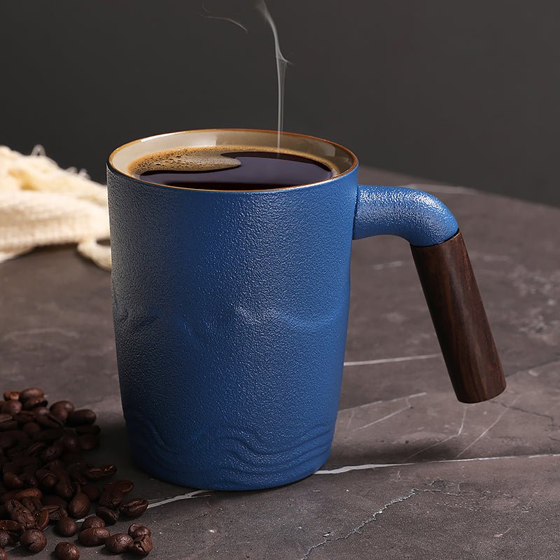
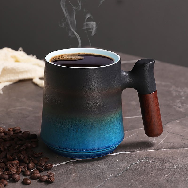
For shoppers who want to browse the full range first, start with our collection of coffee mugs. If you already know you want a specific style, the Christmas Coffee Tea Mug, Green Waves Coffee Tea Mug, and Mountain Sea II Coffee Tea Mug with Wooden Handle are good examples of how artwork and mug style change the final look.
What makes pictures on coffee mugs look sharp instead of blurry?
The short answer: the image needs enough detail for the print size, and the mug needs a surface and shape that do not fight the artwork. A photo that looks fine on a phone screen can look soft on ceramic if the original file is too small or if the design is stretched across the print area.
From what we see in real orders, these are the most common reasons a printed mug disappoints:
- Low-resolution artwork that holds up on screen but breaks apart on a curved mug.
- Poor contrast between the picture and the mug color, especially with pale photos on white ceramic.
- Bad placement where the image gets too close to the handle or wraps awkwardly around the body.
- Overcrowded layouts with too much text or too many small details competing with the picture.
If you want a more detailed buying checklist, our article Coffee Mugs with Pictures: What to Check Before You Buy breaks down the key inspection points before checkout.
One practical rule: strong photos, clean illustrations, and bold seasonal graphics usually hold up better than busy collages. That is one reason nature scenes and simple holiday art tend to look dependable on mugs.
Which mug styles work best for pictures on coffee mugs?
Not every mug shape gives the same result. A standard straight-sided ceramic mug gives artwork a more predictable print zone, while a mug with a curved body can slightly change how the image reads from left to right. We think about the mug the same way a customer does at the table: how it feels in the hand, how easy it is to sip from, and whether the picture is visible when the mug sits on a desk.
| Mug style | Best for | Trade-off |
|---|---|---|
| Standard ceramic mug | Everyday photos, logos, simple graphics | Safe choice, but less distinctive |
| Mug with colored artwork | Nature scenes and strong visual contrast | Artwork can feel busier if the design is too detailed |
| Mug with wooden handle | Gift buyers who want a more finished look | Not the best choice if you want a fully classic diner-mug feel |
Our Mountain Sea II Coffee Tea Mug with Wooden Handle is a good example of a mug that feels more handcrafted on a kitchen shelf. The handle changes the visual balance, so the picture does not need to do all the work by itself. That style suits buyers who want something a bit more elevated for gifting, but it is not the best pick if you want a plain, workhorse mug for heavy daily rotation.
For a more classic printed look, the Green Waves Coffee Tea Mug shows how a cleaner color story can make the picture easier to read at a glance. If you are choosing for office desks, that kind of simple visual often performs better than a crowded design.
How do you tell if a printed mug will hold up in daily use?
This is where real-world handling matters. A mug that looks nice on arrival still has to survive sink rinses, cupboard stacking, and the occasional scrape against a spoon. We look for durability in the surface, the print edge, and the parts people touch most.
Here is what we check in our own store before we recommend a mug:
- Surface finish: A smooth ceramic surface usually gives pictures cleaner edges and easier wipe-downs.
- Handle comfort: If the handle feels cramped, the mug may be avoided even when the print is attractive.
- Print placement: The image should sit far enough from the handle that it still looks centered when held.
- Care routine: Mugs intended for everyday use should be easy to wash and not require special handling just to keep the picture looking decent.
We do not recommend picture mugs as the best choice for someone who wants a totally plain, no-fuss mug for rough kitchen use or for someone who plans to use one mug in a commercial setting all day. A decorative printed mug is better treated as an everyday personal mug or a gift mug.
If you want help separating premium-looking options from cheaper-looking ones, our post Coffee Mugs with Pictures: How to Pick a Print That Feels Premium is worth a read before you decide.
What should gift buyers check before ordering pictures on coffee mugs?
Gift buyers usually care less about technical specs and more about the unboxing moment. That is fair. A mug can be practical, but if it feels flimsy or the picture looks off-center, the gift lands badly.
For gift shopping, we suggest checking these details before you buy:
- Color story: Does the picture match the recipient’s style, or is it just visually loud?
- Seasonal fit: A holiday design should feel intentional, not generic.
- Display value: Will the mug look good on a desk or shelf after the coffee is gone?
- Cleaning ease: A gift mug should not require special care that makes it annoying to use.
The Christmas Coffee Tea Mug is a straightforward example of a picture mug that works well as a seasonal gift. The artwork is the point, so the mug does not need extra explanation. That said, seasonal mugs are not the best buy if the recipient wants something they can use all year without feeling like the holiday is always in the room.
We often tell customers to think about the recipient’s kitchen or office. If their workspace is neutral and tidy, a simple printed mug can stand out nicely. If their desk is already busy, a loud picture may disappear into the clutter.
Which picture styles feel premium instead of cheap?
Premium usually comes down to restraint. A mug does not need to be overloaded to feel finished. In fact, the opposite is often true. Simple compositions, good spacing, and colors that match the mug body tend to feel more deliberate.
Here are the picture styles we see hold up best:
- Landscape or nature artwork with clear foreground and background separation.
- Single-subject designs that do not crowd the print area.
- Seasonal art with a clear theme and limited color palette.
- Graphic wave or pattern designs that fit the curve of the mug body naturally.
The Green Waves Coffee Tea Mug works well for buyers who want a calm, modern feel without the mug looking empty. The pattern gives the eye something to follow, but it does not overwhelm the cup. That balance is harder to get than it sounds.
If you want more buying guidance on this exact question, our article Pictures of Coffee Mugs: What Buyers Should Check Before Ordering covers the practical checks we use for print quality, placement, and fit.
What are the common mistakes buyers make with pictures on coffee mugs?
Most disappointments are predictable. The mug itself is usually fine. The problem is that the design decision was made too quickly.
Watch out for these mistakes:
- Choosing too many tiny details that disappear once the mug is in hand.
- Ignoring the handle side so the picture gets visually cut off where people hold the mug.
- Buying for a special occasion only and later realizing the mug has little everyday use.
- Picking a theme that clashes with the recipient’s actual kitchen or desk setup.
Also, remember the limitation on any picture mug: it is still a mug. If the buyer wants something purely decorative, framed art or a display object may be better. A coffee mug is best when the image supports daily use instead of competing with it.
How do the best picture mugs compare across everyday, seasonal, and gift use?
Different buyers need different outcomes. A mug for Monday morning coffee should not be judged by the same standard as a holiday gift or a shelf-ready decorative piece.
| Use case | Best mug type | Why it works |
|---|---|---|
| Daily kitchen use | Simple printed ceramic mug | Easy to reach for, easy to read, easy to wash |
| Office desk mug | Clean graphic or nature-themed mug | Looks polished without feeling busy |
| Gift mug | Seasonal or distinctive style | Feels more personal at unboxing |
That is why we recommend browsing the full collection before buying. It lets you compare styles side by side instead of choosing from a single image and hoping it works for your space.
And if you are still deciding between a more festive look and a year-round design, compare the Christmas Coffee Tea Mug with the Mountain Sea II Coffee Tea Mug with Wooden Handle. One is clearly occasion-driven. The other has a calmer, more display-friendly feel. That is the kind of trade-off that matters when you are buying for real use.
Frequently asked questions
How do I know if pictures on coffee mugs will look clear in person?
Look for simple, high-contrast artwork and avoid designs packed with tiny details. In real use, the mug is usually seen from arm’s length on a counter or desk, so clarity matters more than ultra-fine detail. A design that reads cleanly from across the room usually holds up better in person.
Are printed coffee mugs safe for daily dishwasher use?
Many printed mugs are meant for everyday washing, but care instructions can vary by product. We recommend checking the specific mug’s care guidance before relying on dishwasher cleaning every day. If you want the design to stay looking its best longer, gentler washing is usually the safer habit.
What size mug works best for pictures?
For most buyers, a standard everyday mug size gives the most balanced look because the artwork has enough space without wrapping awkwardly. If the mug is too small, the design can feel crowded; if it is too large, the picture may look stretched out. If you want help choosing size for daily use, our posts on 10 oz Coffee Mugs and 12 Ounce Coffee Mugs are useful comparisons.
Which picture mug is better for gifting: seasonal or everyday?
Seasonal mugs make a stronger first impression if the occasion is clear, like a holiday gift. Everyday designs are more practical if you want the recipient to use the mug year-round. If you are unsure, a clean nature or pattern design is usually the safer choice.
What should I avoid if I want a premium-looking picture mug?
Avoid overcrowded graphics, low-contrast colors, and images that get too close to the handle. Those are the first things that make a mug look less polished on a kitchen shelf or office desk. Simple layouts with a clear focal point usually feel more intentional.
If you are ready to compare styles side by side, start with the full CoffeifyMug collection and shortlist the mug that fits the way you actually drink coffee: daily use, gift giving, or a display-worthy desk mug. From there, check the picture size, color contrast, and care notes before you buy.
Read more
Nice Coffee Mugs: How to Choose a Mug You’ll Actually Use
We break down the details that make nice coffee mugs worth buying: size, handle feel, rim shape, finish, and the trade-offs between everyday and giftable styles.
Per saperne di più
Michael Myers Coffee Mug: What to Check Before You Buy
A Michael Myers coffee mug should do more than carry the Halloween graphic. We break down size, handle comfort, print quality, and care so you can pick one that still works on a normal morning.
Per saperne di più
Commenta
Questo sito è protetto da hCaptcha e applica le Norme sulla privacy e i Termini di servizio di hCaptcha.