Personalized Coffee Mug Ideas That Actually Look Good
Reading time: about 8 minutes
Personalized mugs are easy to get wrong. A name that is too large, a quote that runs too long, or a design that feels busy can make the mug look more like a draft than a gift. The best personalized coffee mug ideas are usually the simplest ones: clean typography, a limited color palette, and a design that still feels nice on an ordinary Tuesday morning.
At CoffeifyMug, we see the same pattern over and over: the personalized mug people keep using is rarely the loudest one. It is the one that looks balanced on a desk, feels readable from a short distance, and still works with the rest of a kitchen or home-office setup. If you want the fastest current comparison route while reading, start with Pick a Mug Fast, then compare it with the broader Coffee Mug Buying Guide.
What makes a personalized mug look good?
The designs that age well usually share the same traits. They do not try to say everything at once, they leave enough empty space for the mug itself to breathe, and they work with the curve of the mug instead of fighting it. On a rounded ceramic surface, editing matters more than adding.
- Short names or initials usually look cleaner than long text blocks.
- One visual idea such as a monogram, date, or small symbol often looks better than multiple decorative elements.
- High contrast helps the personalization stay readable in real use, not just in a close-up photo.
- Limited colors usually make the mug feel more premium and less crowded.
- Balanced spacing is often what separates gift-worthy from generic.
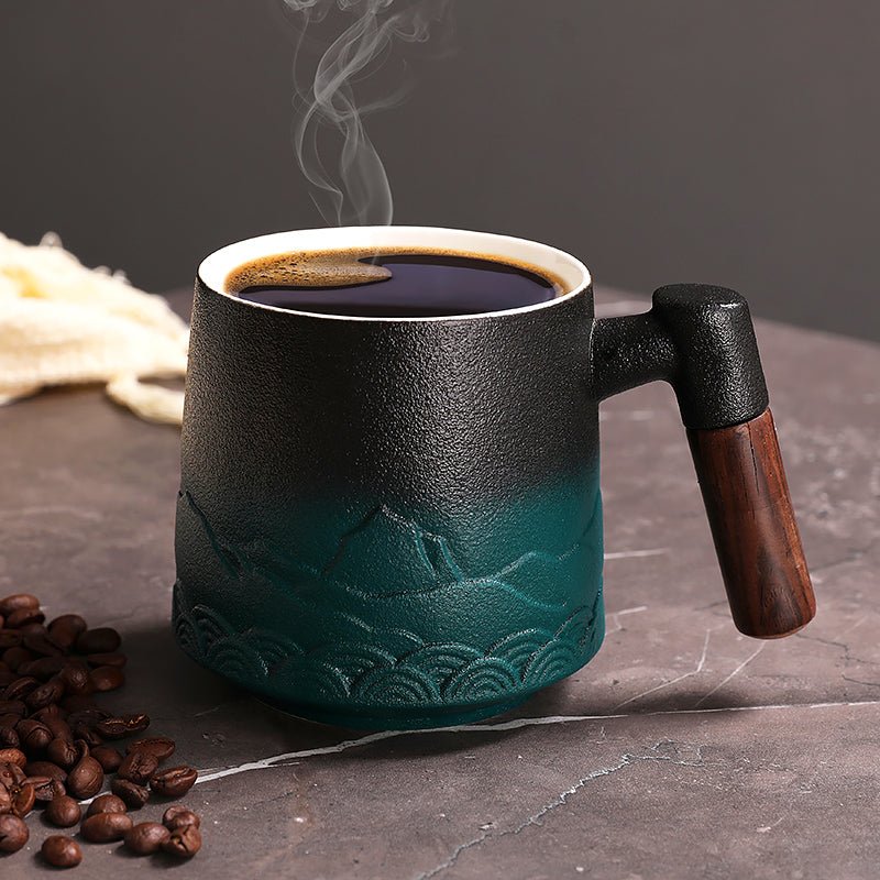
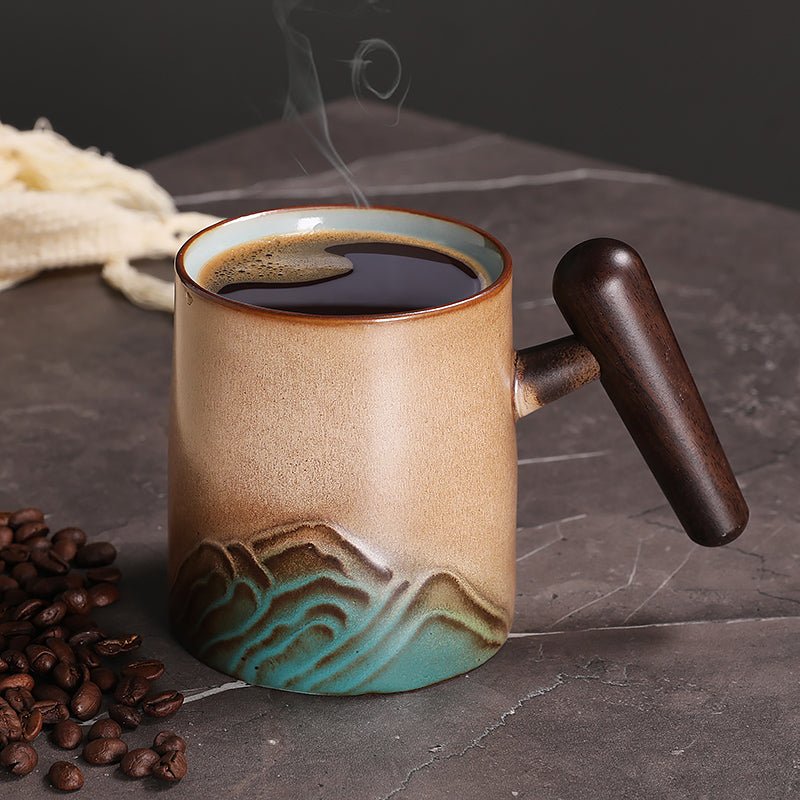
That is why many of the most stylish personalized coffee mug ideas are almost quiet. They feel intentional because they stop at the point where the mug still looks like something you would want on your shelf every day. If you want to compare how different silhouettes carry that kind of design, the live Product Image Gallery is the easiest visual shortcut.
Design ideas that usually look polished
1. Name plus initial combination
This is one of the safest ways to make a mug feel custom while keeping it refined. A first name paired with a larger initial creates structure without needing extra decoration. It works especially well for gift buyers who want something personal but not overly specific.
2. Monogram with a thin border
A monogram can look elegant when the letters are spaced properly and the border stays subtle. Heavy frames and ornate flourishes tend to date the design faster. A thin circle, line, or square border usually feels more modern and easier to live with in a calm kitchen or office corner.
3. Short phrase with room to breathe
Short quotes can work, but only if they are truly short. A mug is a small surface, so the best phrases are usually two or three words rather than a full sentence. If the phrase needs to be explained, it is probably too long for the mug.
4. Initial with one small icon
If you want the mug to feel personal without using a full name, pairing a single initial with a small icon can work well. A coffee bean, star, heart, or leaf can support the design without taking over. The icon should stay secondary to the main mark.
5. Date-based personalization
A birthday, anniversary, year, or simple memorable date can be surprisingly tasteful when it is formatted cleanly. Dates work best when the layout is restrained and the typography carries the meaning rather than extra decorative copy.
6. Location-based personalization
A city name, neighborhood, or place tied to a memory can make a mug feel personal in a way that still looks design-friendly. This is often better than a longer sentimental message because the location itself does the emotional work.
Color and font choices that change the result
Many personalized mugs look better or worse because of color and font more than the actual message. A simple layout can look premium with the right typeface and color balance. A busy idea can still look inexpensive if the font stack and color choices are doing too much.
Font tips
- Use one font family unless there is a very clear reason to mix styles.
- Prioritize readability over decorative scripts, especially for smaller text.
- Keep script fonts short so letters do not collapse into each other.
- Match the mood to the person: modern, relaxed, playful, or classic.
Color tips
- Dark text on a lighter mug is still the safest choice for readability.
- One accent color usually adds enough personality without becoming noisy.
- Soft neutrals tend to age better than bright multi-color mixes.
- Intentional contrast matters more than picking a trendy palette.
If the mug is meant for a desk, subtle tones and cleaner type usually work best. If it is meant as a gift, you can push the personality slightly further, but it still helps to keep the design readable at a glance. For a broader comparison of shapes that suit different moods, compare the Round Coffee Tea Mug with the Landscape Tall Coffee Tea Mug.
Which personalization style fits which buyer?
| Buyer type | What usually looks best | What to avoid |
|---|---|---|
| Minimalist | Monograms, initials, single-word designs | Busy graphics, too many colors, dense text |
| Gift buyer | Name plus icon, date, short phrase | Overly niche jokes that will age fast |
| Home-office user | Clean typography, muted tones, subtle personalization | Bright novelty layouts that feel distracting |
| Sentimental buyer | Meaningful location, anniversary date, inside joke kept short | Long copy that takes over the mug |
| Daily coffee drinker | Readable name, strong contrast, balanced placement | Tiny text or fragile-looking visual detail |
This kind of filtering helps because the mug should match the person first and the occasion second. A design can be technically cute and still wrong for the recipient's everyday taste. In our experience, the best personalized mug is the one that still feels natural when the novelty moment is gone.
What to avoid if you want the mug to age well
- Too much text makes the mug harder to read from a normal distance.
- More than two font styles usually makes the layout feel scattered.
- Extra clip art often makes the mug feel generic instead of custom.
- Low-contrast colors can make the personalization disappear in real use.
- Designs with no empty space tend to feel louder and cheaper over time.
It also helps to imagine the mug after a few weeks of use. Will it still look good next to a keyboard, on a breakfast tray, or on a kitchen shelf? Will it still feel like a real mug and not just a novelty prop? Those are the questions that usually lead to better choices.
A short checklist before you buy or gift
- Decide the purpose: gift, desk mug, daily kitchen mug, keepsake, or event item.
- Pick one personalization element: name, initial, date, phrase, or location.
- Choose the tone: minimalist, playful, classic, or sentimental.
- Check readability: can you understand the design quickly?
- Look for balance: does the personalization leave enough empty space?
- Match the shape: does the mug silhouette fit the style you want?
If you are still torn between styles, do not start with the whole catalog. We usually recommend comparing one guide, one fast landing page, and two or three strong product shapes instead. That is the easiest way to keep the decision practical without losing the personal part. A good starting trio is Pick a Mug Fast, the Coffee Mug Buying Guide, and the live Product Image Gallery.
The strongest personalized mugs are not crowded. They are clear, readable, and pleasant to live with every day. If you keep the design simple, specific, and balanced, you usually end up with something that feels more thoughtful and looks better for longer.
Read more
14 Ounce Coffee Mugs: Size, Fit, and Buying Guide
A practical guide to 14 ounce coffee mugs with size, material, and fit details that matter in daily use. We cover where this size works well, where it falls short, and what to check before you buy.
Per saperne di più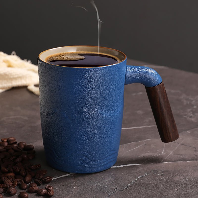
Ceramic vs porcelain mugs: which lasts longer
A practical comparison of ceramic and porcelain mugs focused on durability, feel, use case, and what buyers should actually check before ordering.
Per saperne di più
Commenta
Questo sito è protetto da hCaptcha e applica le Norme sulla privacy e i Termini di servizio di hCaptcha.