Coffee Mug Printing: How to Choose the Right Mug for Your Artwork
Reading time: about 8 minutes
We see the same failure over and over: a logo looks clean on a screen mockup, then the first physical mug makes the artwork sit too close to the handle, drift over the seam, or disappear against the glaze. Coffee mug printing only looks simple until the shape, coating, and print method meet real hands, real dishwashers, and a real office desk.
In our store, we treat mug printing as a fit problem first and a design problem second. The mug has to hold the artwork in the right place, on the right surface, with a finish that still looks good after everyday use.
What makes coffee mug printing look crisp instead of cheap?
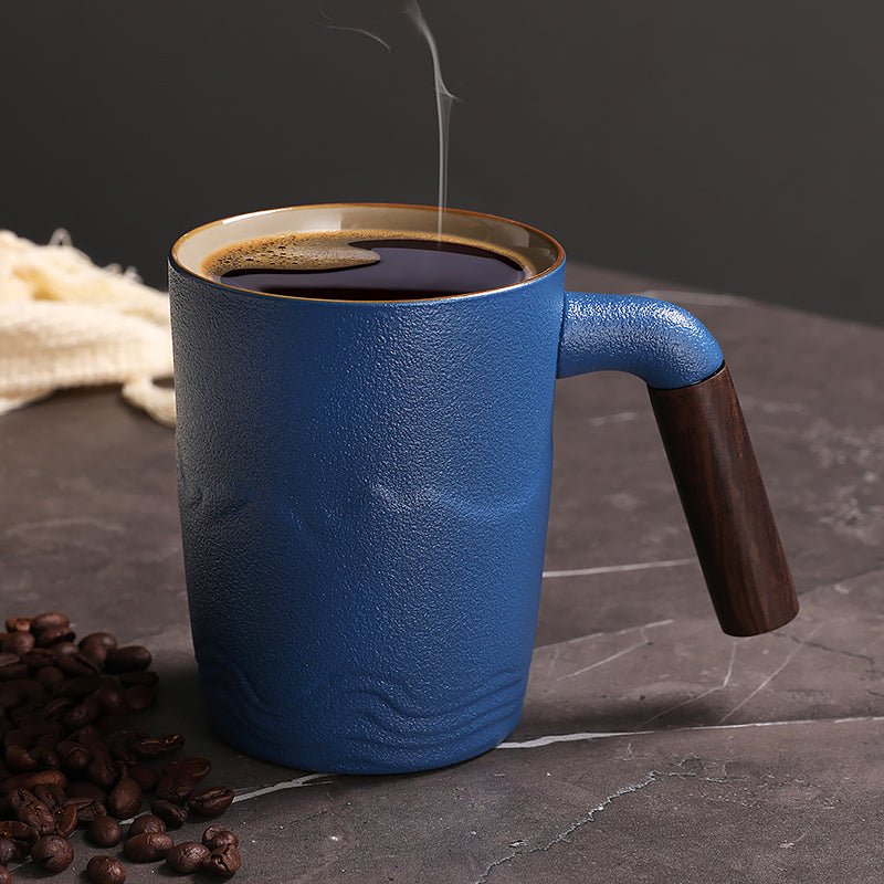
The biggest difference usually starts with the mug body itself. A smooth ceramic mug with a consistent glaze gives the print a flatter, more predictable surface, while a rougher or heavily curved body can make edges look uneven or slightly distorted. That matters when your artwork has small text, thin linework, or a logo that needs to read from across a kitchen counter.
We also watch for the failure modes that show up after the first wash. Banding, haloing around dark edges, pinholes in the transfer, and color shift near the wrap edge are all signs that the print process or the blank mug was not matched well enough. If your design depends on tight alignment, the mug should have enough clear space near the handle and rim so the art does not feel cramped.
- Use a smooth, coated surface so the artwork lands evenly.
- Leave breathing room near the handle and top edge.
- Favor bolder type if the mug will be seen at arm's length on a desk or shelf.
- Check the wrap edge because that is where many print defects become obvious first.
For buyers comparing specs before they order, our article on Coffee Mug Printing: What Buyers Should Check Before Ordering covers the proofing questions we ask before anything goes to production.
Which mug shape should you choose for the print you want?
Shape matters more than most buyers expect. A mug that looks great in a product photo may give you less usable print space once the handle, curve, and lip are taken into account. If your design is simple, almost any clean ceramic shape can work. If you need a full wrap, a detailed illustration, or a specific logo placement, the body style starts to matter fast.
These three options are a good starting point when you want different visual outcomes:
| Mug style | Best for | Main trade-off |
|---|---|---|
| The Gradient Coffee Tea Mug | Modern branding, warmer presentation, artwork that benefits from a color background | Strong background color can reduce contrast if your logo is very light or thin |
| Retro Coffee Tea Cup | Nostalgic styling, simple marks, gift sets with a more casual look | Retro proportions may not suit large wraparound layouts |
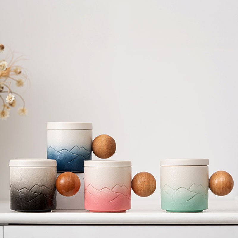
| Ball Handled Coffee Tea Mug | Presentation pieces, desk display, designs that need a strong silhouette | The handle shape can tighten your placement options on the print zone |
If you want to compare more bodies before you commit, start with our all mugs collection. It is easier to spot the right silhouette there than in a generic mockup sheet.
Which print method fits your artwork?
Not every design should be printed the same way. Full-color art, solid logos, and small placement marks each ask for a different approach, and the wrong choice is where buyers end up disappointed with washed-out color or fuzzy edges. The goal is not the fanciest method. It is the one that matches the artwork and the mug surface.
Here is the practical version we use when talking with shoppers:
- Sublimation works well for full-color art, soft gradients, and photo-style layouts on the right coated surface. It is not the best answer if the mug body is uncoated or the artwork needs heavy white ink support.
- Screen printing is strong for bold spot colors and repeatable logos. It is less friendly to tiny type, subtle blends, and designs that depend on fine tonal changes.
- Pad printing can be useful for smaller marks on curved areas. It is not the right choice for large wraparound artwork or photographic detail.
- Decal-based printing can handle detail, but the result depends on the firing, glaze, and how the image is transferred. It is not a shortcut for every design.
That trade-off matters in real buying decisions. A brand that wants a clean icon on a desk mug usually benefits from a different print path than a customer who wants a full-color holiday illustration for gifting.
What should you check before you approve a proof?
The proof is where most problems can still be avoided. A design can look correct on screen and still fail once it is mapped to the mug curve, especially around the handle and the edge of the wrap. The proof should answer a few basic questions before anyone prints the order.
- Does the printable area match the actual mug shape, not just the artwork file?
- Is there enough clearance near the handle so the logo does not feel jammed to one side?
- Will the colors still read clearly against the mug finish, especially on darker or colored bodies?
- Are small letters and thin lines still legible at real viewing distance?
- Do the care instructions match the print method, especially if the mug will go through regular washing?
We also recommend comparing the proof against real use cases: a kitchen counter, a shared office desk, or a gift unboxing. Those are the places where placement mistakes, awkward proportions, and weak contrast become obvious. For a deeper buying checklist, our guides on 10 oz Coffee Mug: Size, Fit, and What to Check Before You Buy and 12 Ounce Coffee Mug Buying Guide for Daily Use and Better Fit are useful if you are comparing sizes rather than just artwork.
Which mug size is safest for daily use and gifting?
Size affects more than capacity. It changes how the mug feels in the hand, how much room you have for artwork, and whether the mug looks balanced on a desk or breakfast table. A smaller mug can feel tidy and controlled, while a larger one gives you more visible print area but can also look heavier and take up more room in a cup holder or cabinet.
For most buyers, the decision comes down to use case:
- 10 oz is often a good fit for a neater everyday mug or a gift that feels compact and intentional.
- 11 oz is the middle ground that many shoppers recognize quickly. It is usually the safest starting point if you want a standard everyday feel.
- 12 oz gives more visual presence and can make a printed design feel larger, but it is not always the best choice for someone who prefers a lighter cup.
If you are buying for a team, a client gift, or a mixed audience, size consistency matters. A mug that feels too small can seem underwhelming; a mug that feels oversized can be awkward in daily office use. That is why we usually suggest matching the size to the setting before matching it to the artwork.
How should a printed mug be cared for?
Care is where a good print earns its keep. A mug that lives on a shelf for occasional use has a different requirement than one that gets washed every day in a busy kitchen or office break room. Repeated dishwasher cycles, harsh scrub pads, and long soaking are the stress points we watch most closely because they expose weak edges and poor curing quickly.
Use these care rules as the baseline unless the product instructions say otherwise:
- Wash gently if the print method or care label recommends it.
- Avoid abrasive scrubbers that can dull the surface and the artwork.
- Keep the mug out of extreme thermal shock, such as moving it from very hot liquid to very cold water too quickly.
- Check whether the print is suited for dishwasher use before you rely on it in a shared kitchen.
Some mugs are better for gifting and display than for hard daily service. If you need a mug for constant commercial dishwashing, metallic effects, heavy texture, or highly detailed all-over wraps, a standard printed ceramic mug may not be the right production path. Ask for a sample or a different build instead of forcing the design into the wrong format.
Frequently asked questions
What is the best mug finish for coffee mug printing?
A smooth glazed ceramic finish is usually the safest choice because it gives the artwork a more even surface and better contrast. Glossy mugs often make colors look brighter, while matte or textured finishes can soften detail. If your design uses fine type or thin lines, avoid rough surfaces.
Can printed coffee mugs go in the dishwasher?
Sometimes, but not always. It depends on the print method, the cure, and the care instructions for that specific mug. If the mug will be washed often, confirm whether the print is rated for routine dishwasher use or if hand washing is the safer option.
What size is best for office giveaways?
We usually see 11 oz and 12 oz mugs work well for office giveaways because they feel familiar and hold enough liquid for daily use. A 10 oz mug can also work if you want a more compact feel or a tidier gift presentation. The better choice depends on whether the mug is meant for desk use, home use, or a gift box.
What should I do if I am still comparing mug styles?
Start with the shape, then check the print area and care notes. Our all mugs collection is the fastest way to compare bodies side by side, and the size guides above will help you rule out options that look good online but do not fit the way you want the mug to be used.
Read more
Coffee Mug Designs: How to Choose the Right Mug for Daily Use
A practical look at coffee mug designs that compares shape, feel, cleaning, and shelf fit so you can choose a mug that works at home or at the desk.
Per saperne di più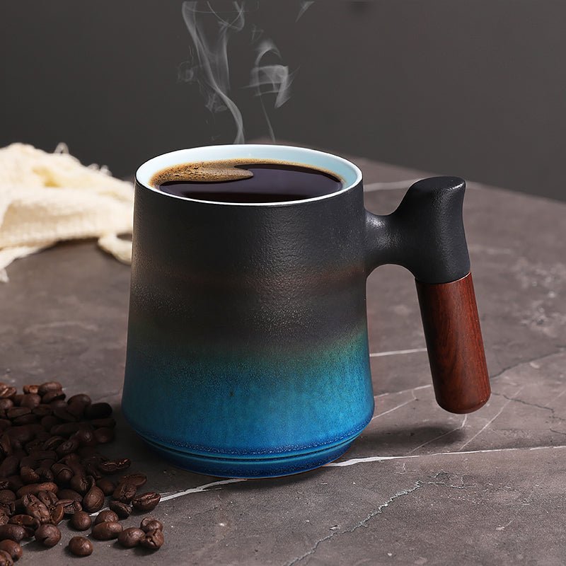
Cracker Barrel Coffee Mugs: What Buyers Should Check Before Ordering
A practical buying guide to cracker barrel coffee mugs that focuses on size, handle comfort, material, and daily use. We also show what to check before you choose a mug for home, office, or gifting.
Per saperne di più
Commenta
Questo sito è protetto da hCaptcha e applica le Norme sulla privacy e i Termini di servizio di hCaptcha.