Gradient Coffee Mugs: How to Choose Color That Still Feels Calm
Color can change the feel of a coffee break quickly. A plain mug keeps things simple, while a bright patterned mug can become the center of attention. Gradient coffee mugs sit between those two choices. They add color and movement, but the shift from one tone to another can still feel calm and natural.
That is why gradient mugs work well for daily routines. They bring enough personality to a desk or kitchen shelf without needing a bold slogan or complicated illustration. The key is choosing a gradient that fits the space and the way the mug will actually be used.
## Why gradients work well on drinkware
A gradient gives a mug depth. A cup that moves from light to dark, warm to cool, or one shade into another can feel softer than a flat solid color. It also tends to photograph well and display nicely on open shelves.
More importantly, a gradient can feel personal without being too specific. It does not depend on a hobby, animal, quote, or holiday. This makes it flexible for different homes and different drink routines.
## Start with the feeling of the color
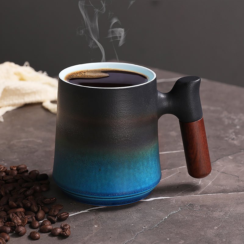
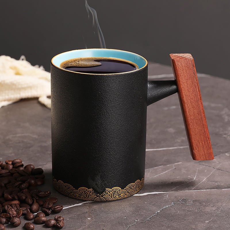
The first choice is not the exact shade, but the feeling. Blue and green gradients often feel calm, clean, or nature-inspired. Brown, cream, and amber gradients feel warm and coffee-friendly. Pink, purple, or sunset tones can feel creative and cheerful. Black-to-gray gradients feel modern and understated.
If the mug will live on a work desk, softer gradients are often easier to enjoy every day. If it is meant to be a cheerful kitchen piece, a brighter transition may make more sense. Think about where the mug will sit when it is not in use, instead of judging it only by a product photo.
## Consider the direction of the gradient
Some mugs fade from top to bottom. Others shift around the body of the mug. A top-to-bottom gradient can make the mug feel taller or more elegant. A side-to-side or irregular glaze can feel more handmade and organic.
Neither is better for everyone. A smooth, even gradient suits a clean desk or modern kitchen. A more irregular gradient suits someone who likes handmade texture and variation. The important thing is that the color change feels intentional rather than accidental.
## Shape still matters more than color
A beautiful gradient will not make an uncomfortable mug better. Check the shape, handle, rim, and base. A medium-size mug with a comfortable handle is usually the safest daily choice. A taller mug may suit tea, lattes, or longer work sessions. A smaller cup may suit a quick morning coffee.
The rim should feel smooth, especially if the glaze changes near the top. The base should feel stable. If a mug is too narrow at the bottom, it may look elegant but feel risky near a keyboard or notebook.
## Matching a gradient mug to a desk
Gradient coffee mugs can be useful desk objects because they add color without adding clutter. A blue or green gradient can soften a technical setup with screens and cables. A warm gradient can make a plain desk feel more inviting. A darker gradient can look polished in a minimal workspace.
Keep the surrounding items simple. A neutral coaster, wood tray, or plain notebook lets the gradient do the visual work. If the desk already has many colors, choose a gentler mug so the space does not become noisy.
## Matching a gradient mug to a kitchen
In a kitchen, a gradient mug can help connect different colors. For example, a green-to-cream mug can work with plants, wood, and white shelves. A blue-to-gray mug can suit stainless steel and cool-toned counters. A warm amber or brown gradient can fit naturally near coffee beans and breakfast items.
If you are building a small mug collection, gradients mix well with solid-colored cups. They add variety without making the shelf feel mismatched. Two or three gradient mugs in related tones can also create a relaxed set.
## Gift ideas for gradient mugs
Gradient mugs make practical gifts because they feel designed but not overly personal. They are good for coworkers, friends, teachers, hosts, and people who enjoy home details. A calm gradient is usually safer than a loud print if you do not know the person's exact taste.
To make the gift feel more complete, pair the mug with a drink that matches the mood. Coffee beans work well with warm gradients. Green or herbal tea suits soft green and blue tones. Hot chocolate can pair nicely with cream, brown, or sunset shades.
## Avoid color that will feel tiring
A mug can look exciting at first and feel too loud after a week. If you want a mug for daily use, choose a gradient you can imagine seeing every morning. High-contrast colors may be fun, but they are not always restful.
Also consider whether the inside of the mug is dark or light. A lighter interior can make coffee and tea color easier to see, while a darker interior can look dramatic but may show residue differently. These small details affect daily satisfaction.
## A color choice that supports the routine
The best gradient coffee mug is not just colorful. It supports the mood of the drink. It might make a desk feel calmer, a kitchen shelf feel warmer, or a gift feel more thoughtful.
Choose color with the same care you would give to size and comfort. When the palette, shape, and feel all work together, a gradient mug can become a favorite because it adds beauty without asking for attention every time it is used.
Read more
Crane Coffee Mugs: A Quiet Symbol for Thoughtful Daily Rituals
Crane coffee mugs bring a calm, graceful motif to daily coffee and tea. Learn how to choose one that feels mature, useful, and gift-ready.
En savoir plus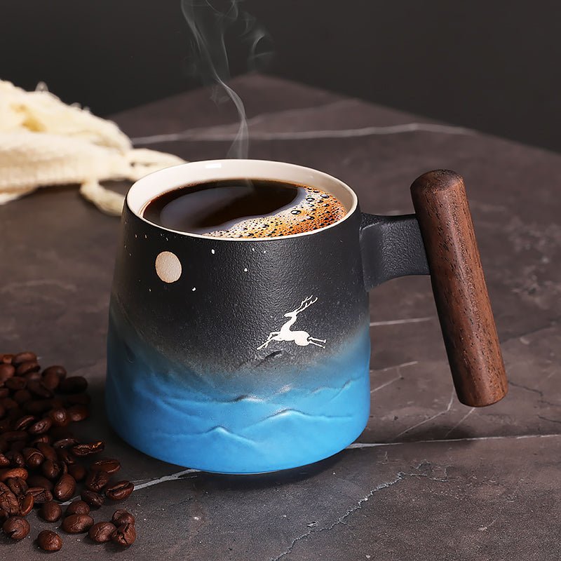
Elk and Moon Coffee Mugs for Cozy Evenings and Quiet Mornings
Elk and moon coffee mugs combine nature, night-sky mood, and cozy daily use. Learn how to choose one for coffee, tea, gifting, and cabin-inspired style.
En savoir plus
Laisser un commentaire
Ce site est protégé par hCaptcha, et la Politique de confidentialité et les Conditions de service de hCaptcha s’appliquent.