Custom Logo Coffee Mugs: What Buyers Should Check Before Ordering
Reading time: about 9 minutes
A logo that looks sharp on a screen can look too small, too busy, or too dark once it lands on a ceramic mug. We see that mistake all the time when buyers are choosing custom logo coffee mugs for office desks, client gifts, or event giveaways.
The right mug depends on more than the artwork. Size, handle comfort, print placement, and daily use all affect whether the finished piece feels polished or cheap. In our store, we try to steer buyers toward the mug that will still look good after it has been used on a kitchen counter, in a break room, and through a few dishwasher cycles.
What should custom logo coffee mugs actually do for your brand?
Custom logo coffee mugs work best when they are used often enough to keep the logo visible and the mug itself pleasant enough to keep on a desk. That is the real goal. A good mug should fit the drink size people actually use, hold up to regular washing, and leave enough clear space around the artwork so the brand mark does not feel crowded.
For office use, a clean ceramic mug with a simple single-color logo usually ages better than a design packed with small text. For gifts, the unboxing matters too. A mug that arrives with a crisp rim, a centered print, and a solid feel in the hand tends to read as thoughtful instead of promotional.
If you are still comparing styles, our broader guide on Custom Coffee Mugs: How to Choose the Right Style, Size, and Print is a useful starting point. It covers the basics that apply before you narrow down to a logo-specific order.
Which mug size fits the way people really drink coffee?
Size is one of the easiest places to make a poor choice. A mug that is too small looks fine on a product page and then frustrates the person using it. A mug that is too large can feel heavy, overfill standard machines, or make a logo look oddly stretched across the front.
For custom logo coffee mugs, the most practical range is usually the classic everyday size band. Smaller mugs are cleaner for espresso drinks and compact desks. Larger mugs suit long office mornings, tea drinkers, and anyone who does not want constant refills.
We usually ask buyers to think in terms of use case rather than just ounces:
- Smaller mugs: better for espresso, short coffee pours, and compact cabinets.
- Mid-size mugs: the most versatile for office kitchens, meetings, and standard drip coffee.
- Large mugs: better for people who want a bigger serving, but they can feel bulky in the hand.
If you want a deeper comparison of common capacities, our size-specific posts on 12 oz Coffee Mugs: What to Check Before You Buy and 16 oz Coffee Mugs: What to Check Before You Buy are worth reading before you commit to a run.
One practical note: a 16 oz mug gives you more print area, but it also gives the logo more space to feel unbalanced if the design is small. A 12 oz mug often looks cleaner with a centered logo and more negative space.
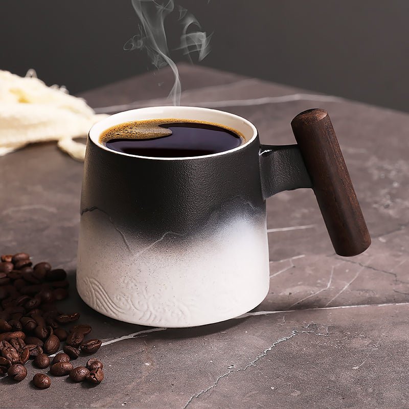
Which material and finish hold up best in daily use?
For this category, ceramic is still the most common and the most practical choice. It feels familiar, takes print well, and works for kitchens, desks, and gifts without much explanation. A smooth glaze also makes the logo easier to read than a textured surface.
That said, not every ceramic mug behaves the same. A glossy finish tends to make color prints pop more clearly. A matte finish looks more modern, but it can show scuffs differently and may not suit every logo. If the brand identity depends on exact color matching, buyers should be cautious with highly saturated artwork, because the mug surface and print method both affect the final result.
Three details we tell buyers to check before ordering:
- Rim and handle comfort: a mug that feels awkward in the hand is less likely to be used every day.
- Wall thickness: thicker walls can feel sturdier and retain heat longer, but they add weight.
- Glaze consistency: a smooth, even glaze helps logos appear cleaner and reduces the chance of visual distraction around the print.
For buyers comparing logo-focused options, our post on Logo Coffee Mugs: What Buyers Should Check Before Ordering covers the same practical checks from a broader branding angle, while Company Logo Coffee Mugs: What Buyers Should Check Before Ordering is useful if the mugs need to feel appropriate for staff, clients, or trade-show use.
Which print method is best for a logo?
There is no single best print method for every logo. The right choice depends on how complex the artwork is, how much color you need, and how you want the mug to age after repeated use.
| Print style | Best for | Trade-off |
|---|---|---|
| Single-color imprint | Simple logos, strong branding, cleaner office use | Not ideal for gradients or fine detail |
| Full-color print | Detailed marks, multi-color brand assets, gift mugs | Can look busy if the design is overcomplicated |
| Minimal logo placement | Premium-looking mugs with a restrained feel | Less visual impact from across a room |
If a logo has small text, thin lines, or subtle gradients, the finished mug may need simplification to stay legible. That is not a defect. It is a practical production limit. A design that looks perfect at full resolution on a website can become muddy when wrapped around curved ceramic.
For buyers who want a higher-end gift feel, we usually recommend keeping the design area clean and letting the mug itself do some of the work. Heavy decoration can make even a good logo feel promotional instead of useful.
Our rule of thumb: if someone cannot read the logo from a normal desk distance, the design probably needs to be simplified before ordering.
What should you check before placing a bulk order?
Bulk orders are where small issues become expensive. A slight misalignment, weak contrast, or awkward mug shape is easy to ignore on one sample and much harder to live with across a full run.
Before ordering custom logo coffee mugs, we recommend checking these points in order:
- Artwork clarity: make sure the logo still reads clearly when scaled down.
- Print placement: confirm whether the logo should face right-handed users, left-handed users, or both.
- Color contrast: review how the logo color interacts with the mug color and glaze.
- Intended use: desk mug, client gift, staff break room, or event giveaway all call for slightly different choices.
- Care expectations: decide whether the mugs need to be easy for everyday washing or mainly for occasional display.
We also suggest thinking about the worst-case scenario. If a mug gets tossed into a busy sink stack or sits in a staff kitchen for months, will the logo still look presentable? That question matters more than a polished mockup.
If you want to see the kinds of products we can match to different buying needs, start with our products page or browse the full collection for the broader range.
What are the common mistakes buyers make with branded mugs?
The biggest mistake is treating a mug like a flat flyer. A mug is a curved object with a handle, a rim, and a viewing angle that changes every time someone picks it up. That changes how the logo reads.
Other common mistakes include:
- Choosing a mug that is too small for the amount of text in the logo.
- Using very fine lettering that disappears once printed.
- Picking a dark mug without checking whether the logo still stands out.
- Ignoring whether the mug will be used in a dishwasher-heavy environment.
- Ordering a style that looks premium in photos but feels too delicate for daily office use.
There is also a trade-off around finish. A glossy white mug is often the safest choice because it gives the logo a clean background. A colored mug can feel more branded, but it also narrows the range of logo colors that will look sharp.
Another limitation: custom logo coffee mugs are not the best choice if the goal is a highly technical or highly detailed brand presentation. If your artwork depends on tiny copy, intricate patterns, or precise photographic detail, a different promotional product may be a better fit. We would rather say that directly than pretend every logo works equally well on every mug.
What are custom logo coffee mugs not good for?
They are not the right answer for every situation. If the mug will be used in a setting where it needs to be ultra-light, collapsible, or travel-friendly, a standard ceramic mug is the wrong category. Likewise, if the main goal is a luxury gift with a very limited impression area, a different material or a more premium vessel may suit the brief better.
They are also not ideal when the buyer wants a design that changes often. Mugs are best for stable branding. If your logo is still being revised, wait until the artwork is final before placing an order. Reordering after a brand update is a waste nobody needs.
For buyers who want the cleanest, most practical option, the best path is usually simple: choose a mug shape that fits the drinking habit, keep the logo clear, and make sure the finish supports everyday use instead of just looking good in the mockup.
Frequently asked questions
What size should custom logo coffee mugs be for office use?
A mid-size mug is usually the safest office choice because it works for standard coffee, tea, and desk use without feeling oversized. If the team uses larger pours or long refill cycles, a bigger mug may make sense. We recommend thinking about how people actually drink during the workday, not just what looks good in a product photo.
Do custom logo coffee mugs need to be dishwasher safe?
For everyday office and gift use, dishwasher compatibility is a strong preference. It makes the mug easier to keep in rotation and reduces the chance of handwashing damage over time. If the mug is more decorative than practical, that trade-off may be acceptable, but it should be clear before ordering.
Can a detailed logo work on a mug?
Sometimes, but not always. Thin lines, tiny text, and fine gradients can lose clarity on a curved ceramic surface. If the logo is complex, it is usually better to simplify it so the printed result stays readable at a normal viewing distance.
Are colored mugs better than white mugs for branding?
Colored mugs can feel more distinctive, but white mugs are usually easier for clean logo contrast and predictable presentation. White is the safer choice if you want the logo to stay the focal point. Colored mugs make more sense when the brand palette is simple and the design has been checked against the final mug color.
What is the best next step if I am comparing options?
Start by choosing the use case: office desk, client gift, or giveaway. Then compare size, finish, and logo complexity against that use case. If you want to browse the practical options first, visit our products page, then narrow from there using the full collection.
If you are still deciding, use this checklist: logo clarity, mug size, color contrast, care expectations, and how the mug will feel in daily use. That is the fastest way to separate a good branded mug from one that just looks fine in a mockup.
More from our blog
Read more

Coffee Mug Logo Buying Guide: Materials, Sizes, and Print Choices
A practical guide to choosing a coffee mug logo for gifts, offices, and resale. We cover mug materials, common size trade-offs, print placement, and what to check before you order.
Read more
Nespresso Coffee Mugs: How to Choose the Right Size and Material
Nespresso coffee mugs need to fit short pours, crema, and everyday cleanup without feeling too small or too bulky. This guide shows what to check before you buy, including size, material, and the t...
Read more
Los kommentaar
This site is protected by hCaptcha and the hCaptcha Privacy Policy and Terms of Service apply.